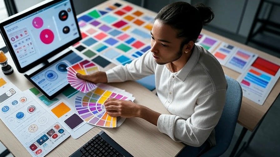
The Psychology of Color in Design
🔴 Red
Bold and powerful, red evokes passion, love, warmth — but also danger and aggression.

💗 Pink
Gentle and romantic. Often used to represent compassion, femininity, and calm.

🟠 Orange
Vibrant and energizing. Linked to creativity, energy, and excitement.

🟡 Yellow
Bright and attention-grabbing. Symbolizes happiness but can also stir irritation if overused.

No comments
Be the first to comment.